Scalable Solutions: Developing a Design System for CreditBook
As the user base grew, a scalable design system became essential to ensure consistency and streamline collaboration within the expanding design team.
As the user base grew, a scalable design system became essential to ensure consistency and streamline collaboration within the expanding design team.

Context: Problem Overview
Context: Problem Overview
Context: Problem Overview
Context: Problem Overview
Client:
CreditBook
My Role:
Designer and Researcher (Full time)
Duration:
May 2022 - Jan 2023
Services Provided:
UI/UX Design, Service Design, Research
When I joined CreditBook as a Product Designer in 2021, I was the only designer in the company. Over the next year, the team grew exponantially after the company made headlines by securing $11 million in pre-Series A funding from Tiger Global, the first Pakistani startup to achieve this milestone.
As the team expanded to 12 members, and the flagship business management app for MSMEs product became more complex, the product faced mounting usability and scalability challenges. New users reported difficulties navigating the app, while some long-time users, particularly those with more mature businesses, began switching to competitors offering a wider feature set. New features we introduced often struggled to gain traction, pointing to underlying design and onboarding gaps.
Additionally, the app’s visual identity closely mirrored WhatsApp, creating a brand misalignment and inconsistent user experience that failed to reflect CreditBook’s unique vision. This prompted an opportunity to redesign the app to address these challenges while positioning it for growth and scalability.


Approach: Research to Dig Deeper and Testing
Approach: Research to Dig Deeper and Testing
Approach: Research to Dig Deeper and Testing
Approach: Research to Dig Deeper and Testing
I had the opportunity to work with the project lead, a Senior Product Designer.
Before delving into potential solutions, it was crucial for us to gain a deeper understanding of our users and uncover their pain points. To achieve this, we conducted user interviews, actively reaching out to both current users and those who recently churned, to gather valuable insights from their perspectives.
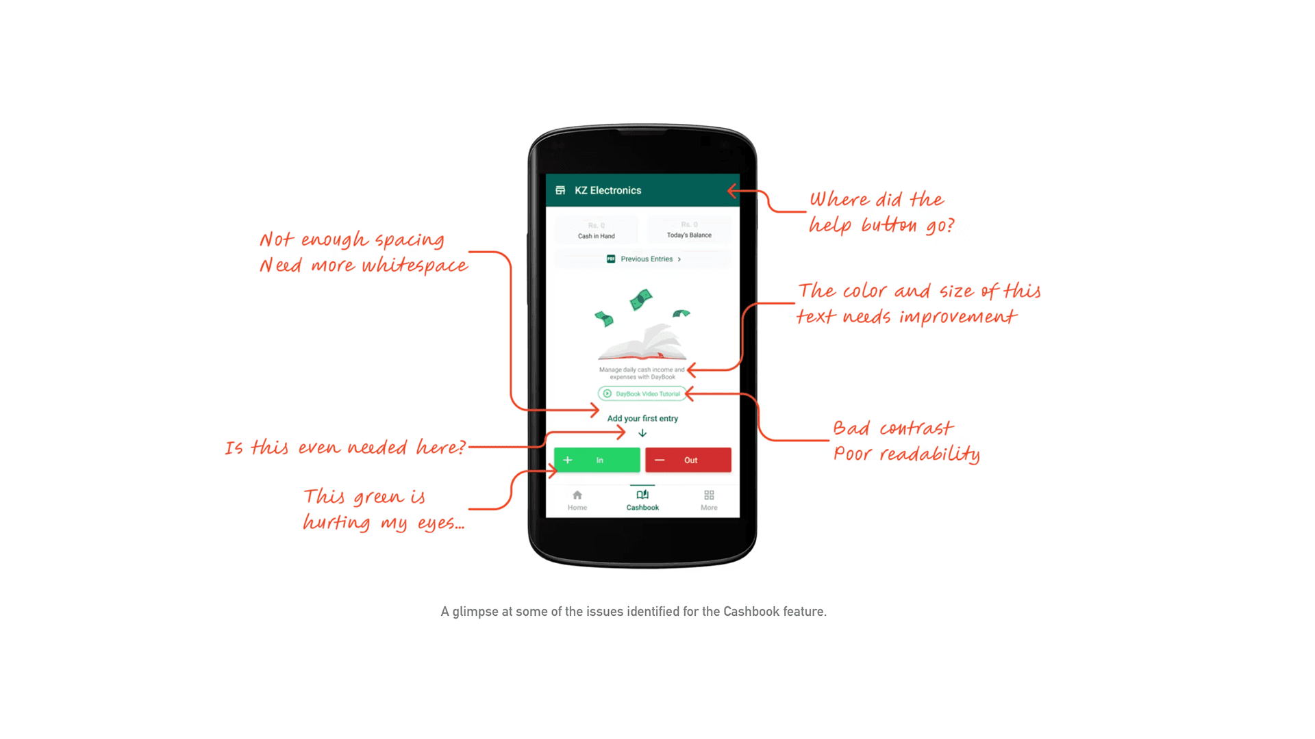
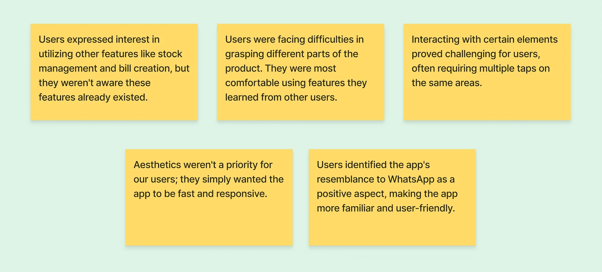
Conversations with Churned Users: Identified that the primary cause for high churn rates was the app's sluggish and lagging performance.
Active User Feedback: Highlighted that new features lacked visibility and sufficient product education, making it challenging for late adopters of technology to navigate the app effectively.
Usability Sessions: Revealed issues such as unresponsive UI elements, with users often needing to tap multiple times, underscoring the need to reevaluate the positioning, sizes, and technical implementation of these elements.
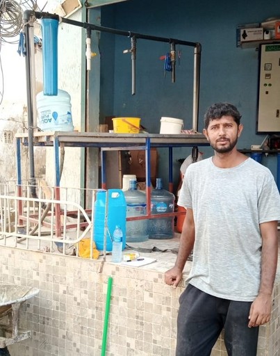
Kalim
Kalim
Works at a furniture store in Karachi
Works at a furniture store in Karachi
“I've been improvising with the ledger feature to manage my inventory. I was not even aware that you guys had a dedicated feature for stock keeping.”
“I've been improvising with the ledger feature to manage my inventory. I was not even aware that you guys had a dedicated feature for stock keeping.”
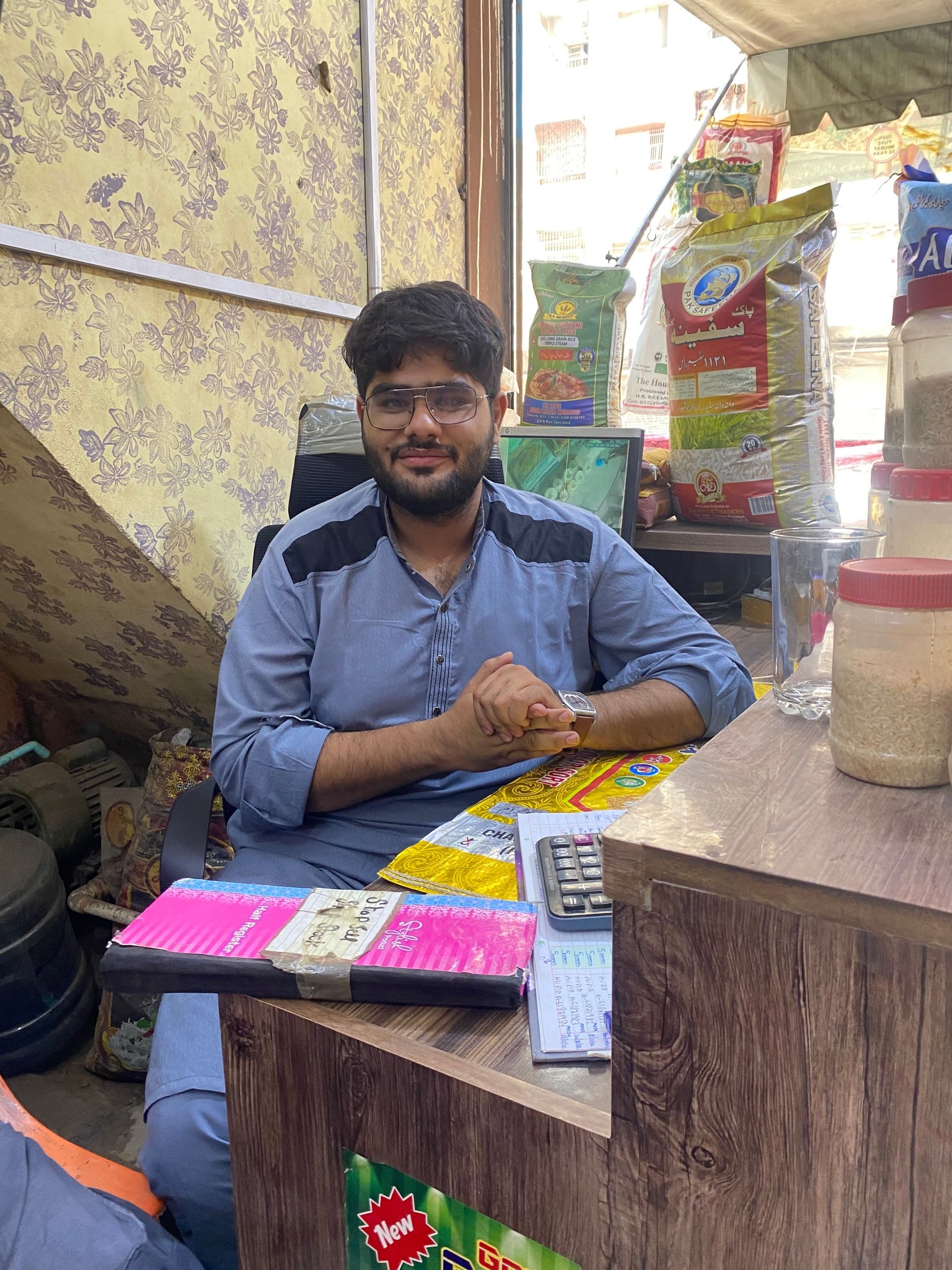
Sadique
Sadique
Shoe wholesaler in Karachi
Shoe wholesaler in Karachi
“The app was very slow and unresponsive at times. Some buttons didn't function properly, requiring me to tap them twice or thrice.”
“The app was very slow and unresponsive at times. Some buttons didn't function properly, requiring me to tap them twice or thrice.”


Solution: The Harmony Design System
Solution: The Harmony Design System
Solution: The Harmony Design System
Solution: The Harmony Design System
UI Consistency & Scalability
Standardization: Established a comprehensive design system that addressed issues like spacing, sizes, typography, and colors, ensuring a consistent visual identity.
Implementation Strategy: Developed a 3 to 4-month plan to update designs with new components, incorporate significant UX changes, and collaborate closely with the engineering team for effective replication.
Enhanced Usability & Navigation
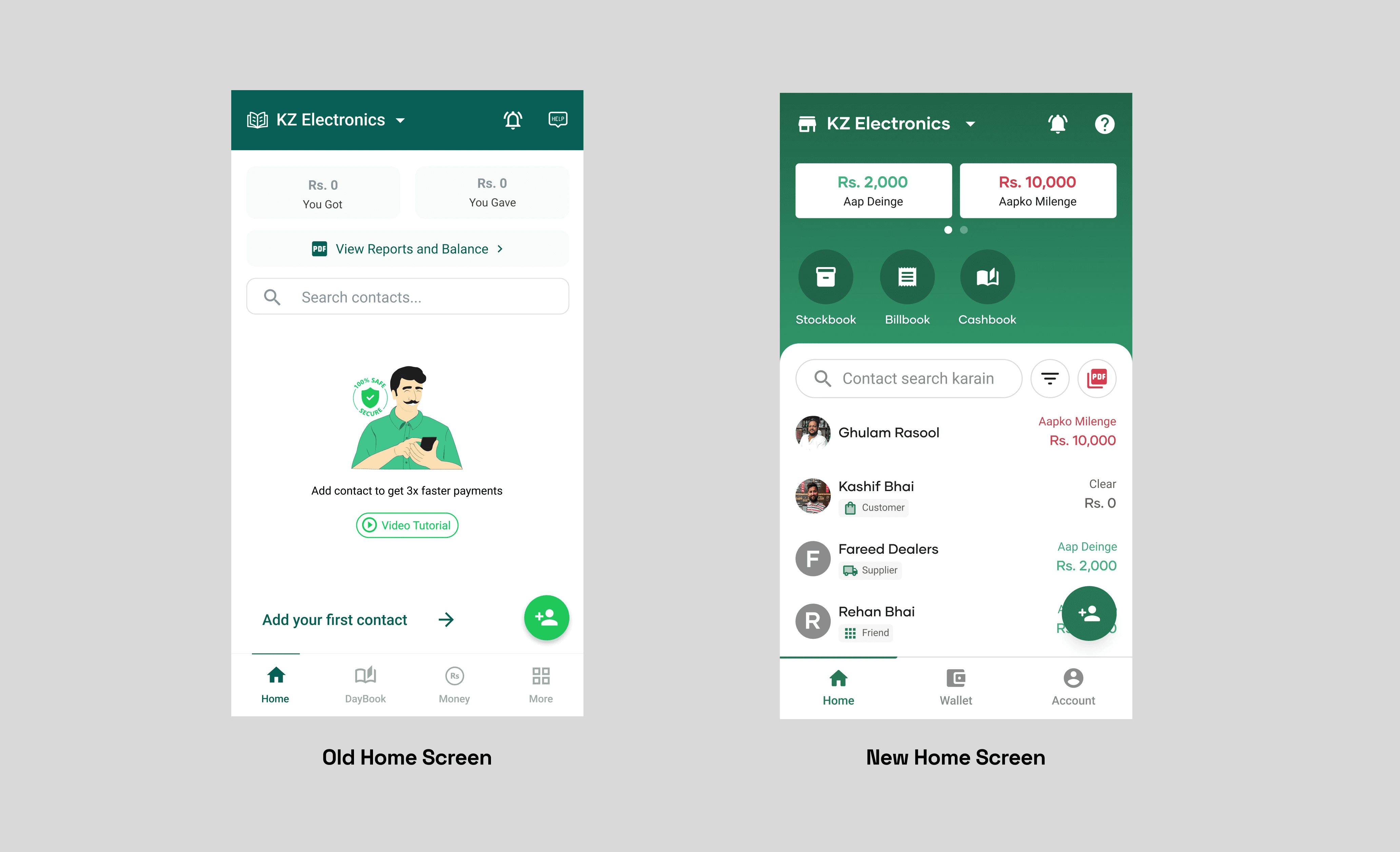
Home Screen Redesign: Led brainstorming sessions to improve scalability and visual hierarchy, resulting in a more intuitive Home screen layout.
Product Education: Implemented contextual tooltips that appear precisely when users might need them, ensuring a seamless journey without overwhelming users with excessive information.
Localization & Brand Alignment
Visual Identity: Redesigned the app to align with CreditBook's brand, moving away from the previous resemblance to WhatsApp.
Improved Development Efficiency
Design System Implementation: Created a "source of truth" that directly resolved many design issues and streamlined the design-to-development workflow.
UI Consistency & Scalability
Standardization: Established a comprehensive design system that addressed issues like spacing, sizes, typography, and colors, ensuring a consistent visual identity.
Implementation Strategy: Developed a 3 to 4-month plan to update designs with new components, incorporate significant UX changes, and collaborate closely with the engineering team for effective replication.
Enhanced Usability & Navigation
Home Screen Redesign: Led brainstorming sessions to improve scalability and visual hierarchy, resulting in a more intuitive Home screen layout.
Product Education: Implemented contextual tooltips that appear precisely when users might need them, ensuring a seamless journey without overwhelming users with excessive information.
Localization & Brand Alignment
Visual Identity: Redesigned the app to align with CreditBook's brand, moving away from the previous resemblance to WhatsApp.
Improved Development Efficiency
Design System Implementation: Created a "source of truth" that directly resolved many design issues and streamlined the design-to-development workflow.


Implementation Plan for Harmony Design System
Implementation Plan for Harmony Design System
Implementation Plan for Harmony Design System
Implementation Plan for Harmony Design System
With a “source of truth” in place, many design issues were directly resolved, such as spacing, sizes, typography, and colors. We created an implementation strategy that spanned around 3 to 4 months. This included updating designs with new components, incorporating significant UX changes, and collaborating closely with the engineering team to ensure the design system was effectively replicated on their end.
One key goal was to improve the scalability and visual hierarchy of the Home screen. I led a brainstorming session with my team, during which we collaboratively generated various ideas for better usability. The team, including Head of Design, and Senior Designer leading this project, together arrived at a decision with the goal of providing users an intuitive experience and enhancing visibility of additional tools that can benefit their businesses.


Outcomes
Outcomes
Outcomes
Outcomes
Feedback: Qualitative feedback revealed that most users favored the cleaner, improved interface and the ease of discovering new features on the Home screen. These updates distinguished CreditBook's user experience from competitors. However, the issue of slow app performance still required attention, with the engineering team committed to solving these problems.
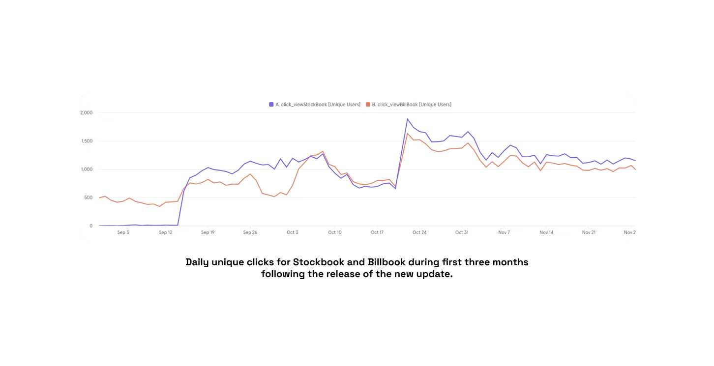
Data: The launch of the revamped app featured complete analytics integration, better feature visibility, and product education that had been absent previously. Three months following the release, data showcased substantial user engagement with features like StockBook and BillBook, effectively opening up new avenues for growth and opportunities as the company explored these data points.
Efficiency: The design team experienced a significant improvement in their processes, leading to increased efficiency and consistency. Interestingly, even non-design team members actively engaged in ideation by using the design system. This strengthened our collaboration with engineering and product, driving us to continually enhance our workflows for more effective results.
Feedback: Qualitative feedback revealed that most users favored the cleaner, improved interface and the ease of discovering new features on the Home screen. These updates distinguished CreditBook's user experience from competitors. However, the issue of slow app performance still required attention, with the engineering team committed to solving these problems.
Data: The launch of the revamped app featured complete analytics integration, better feature visibility, and product education that had been absent previously. Three months following the release, data showcased substantial user engagement with features like StockBook and BillBook, effectively opening up new avenues for growth and opportunities as the company explored these data points.
Efficiency: The design team experienced a significant improvement in their processes, leading to increased efficiency and consistency. Interestingly, even non-design team members actively engaged in ideation by using the design system. This strengthened our collaboration with engineering and product, driving us to continually enhance our workflows for more effective results.
Project learnings
Project learnings
Project learnings
Working on a multilingual B2B product for low-tech users came with its fair share of hurdles, but it also brought forth some valuable lessons.
Adapting to local context: In certain cases, it was acceptable to deviate from design norms and trends in order to create a localized solution tailored to address specific problems.
Prioritizing user needs: While the CreditBook app might not have stood out for its visual appeal, its functionality effectively served our users' requirements, and ultimately, that was the bigger goal.
