Client:
Klarna
My Role:
Digital Designer
Duration:
2020
Service Provided:
Product Design, Mobile Design
Autism Assisted Pakistan is a portal that provides contextualized information regarding autism to the local population.


Our users made it clear: they wanted a simple, fast, and reliable way to generate invoices. Here’s what we discovered:
User Demand: Just in the month of June, 50+ user requests for an invoicing feature came through our customer support channels.
Field Research Insights: Power users in Karachi and Lahore repeatedly asked for an invoicing or billing feature.
Market Landscape: Competitors were already offering invoicing features, pushing us to innovate and prevent user churn.
In short: We had to deliver an invoicing solution that was quick, easy, and familiar to our users—or risk losing them to other apps.
Before diving into design, we needed to answer some critical questions:
Do users need invoicing in a digital app?
What does invoicing look like in real-life transactions?
What information is essential for these users?
How can we make this feature intuitive for a non-digital audience?
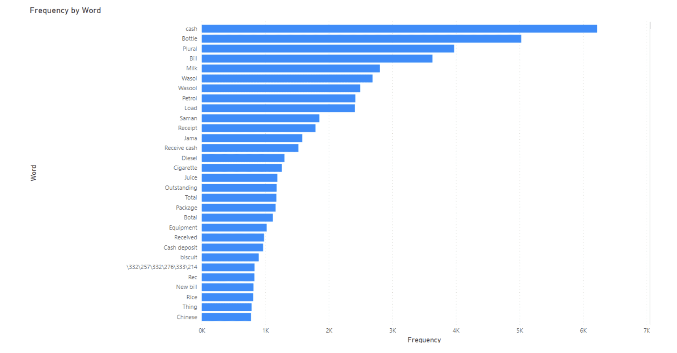
Surprising Discovery: We found that 43% of our active users were already using the "notes" feature to manually create invoices—a clear sign of demand!
Using Amplitude, we further investigated user behavior within the app. The analysis showed that:
62% of entered data in the notes section were just numbers .
Further investigation revealed that those notes were being used as an invoice hack in the CreditBook app!
Key learnings: Users were noting down purchase and sales details while inputting transactions. To add value, the invoicing feature needed to be integrated into the existing transaction flow while also existing as a standalone feature.
In our analysis of both local and global apps, we saw two patterns:
Complex Flows: Apps like Vyapar and Udhaar required heavy manual effort, making them slow and clunky compared to a quick scribble on a piece of paper.
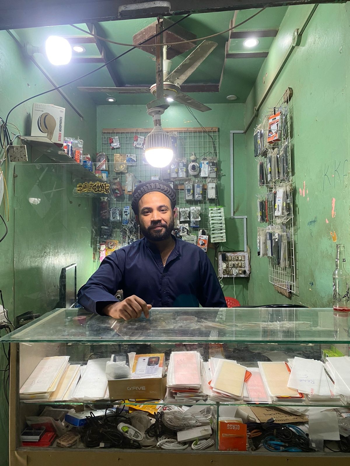
Language Barriers: The use of accounting jargon ("invoicing," "receipts") confused users. Our field research showed that merchants commonly used the term "bill" instead.
Mental Model: The digital invoices were not laid out in columns and rows like physical invoices, causing confusion to the users while inputting data
Key Takeaway: We had to keep it simple, intuitive, and faster than traditional paper-based methods.


Armed with our initial findings, we interviewed 15 CreditBook users to further understand their needs. Once we had a clearer understanding, we set out to design a feature that felt familiar and met users' mental models. We introduced:
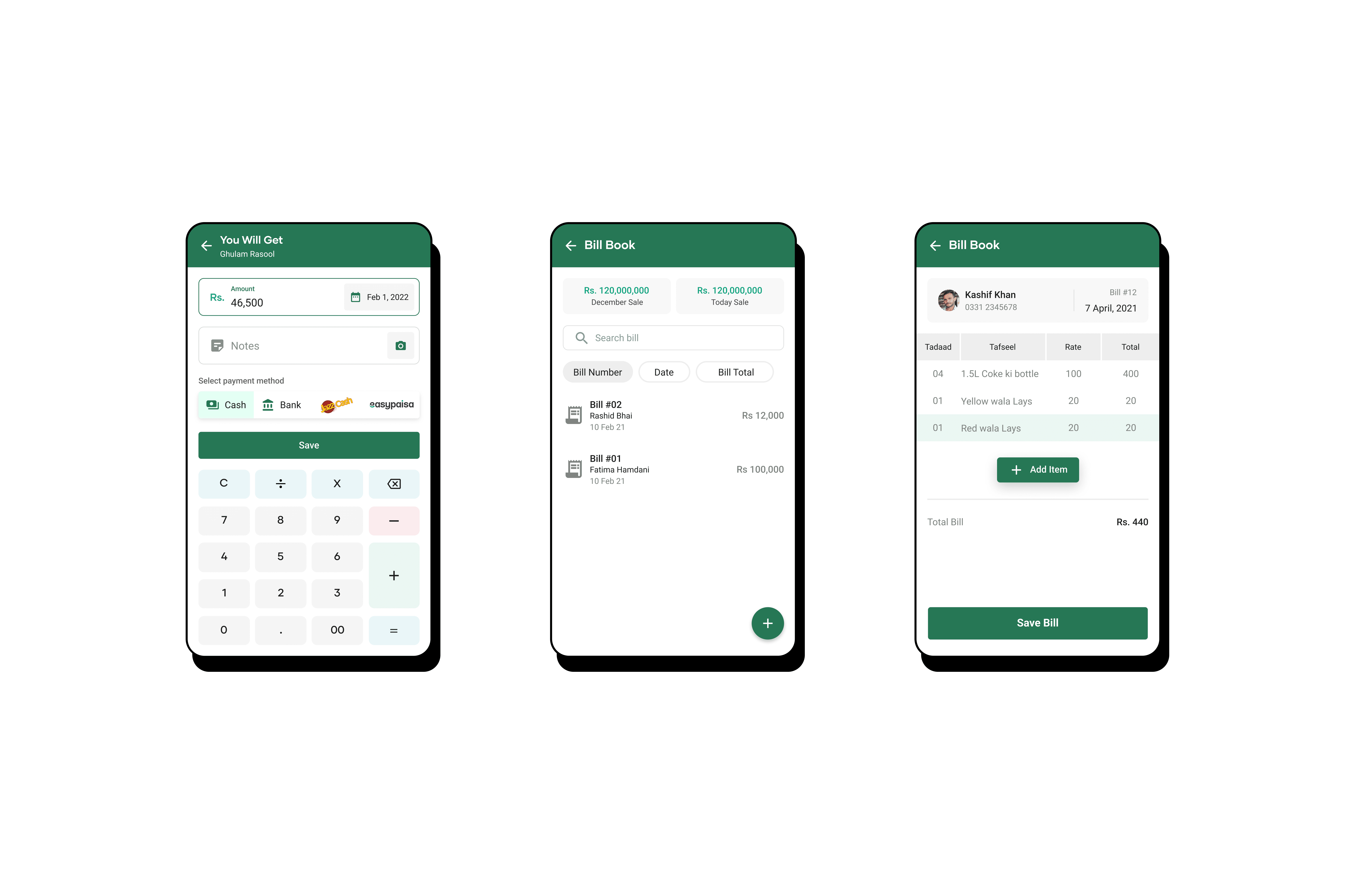
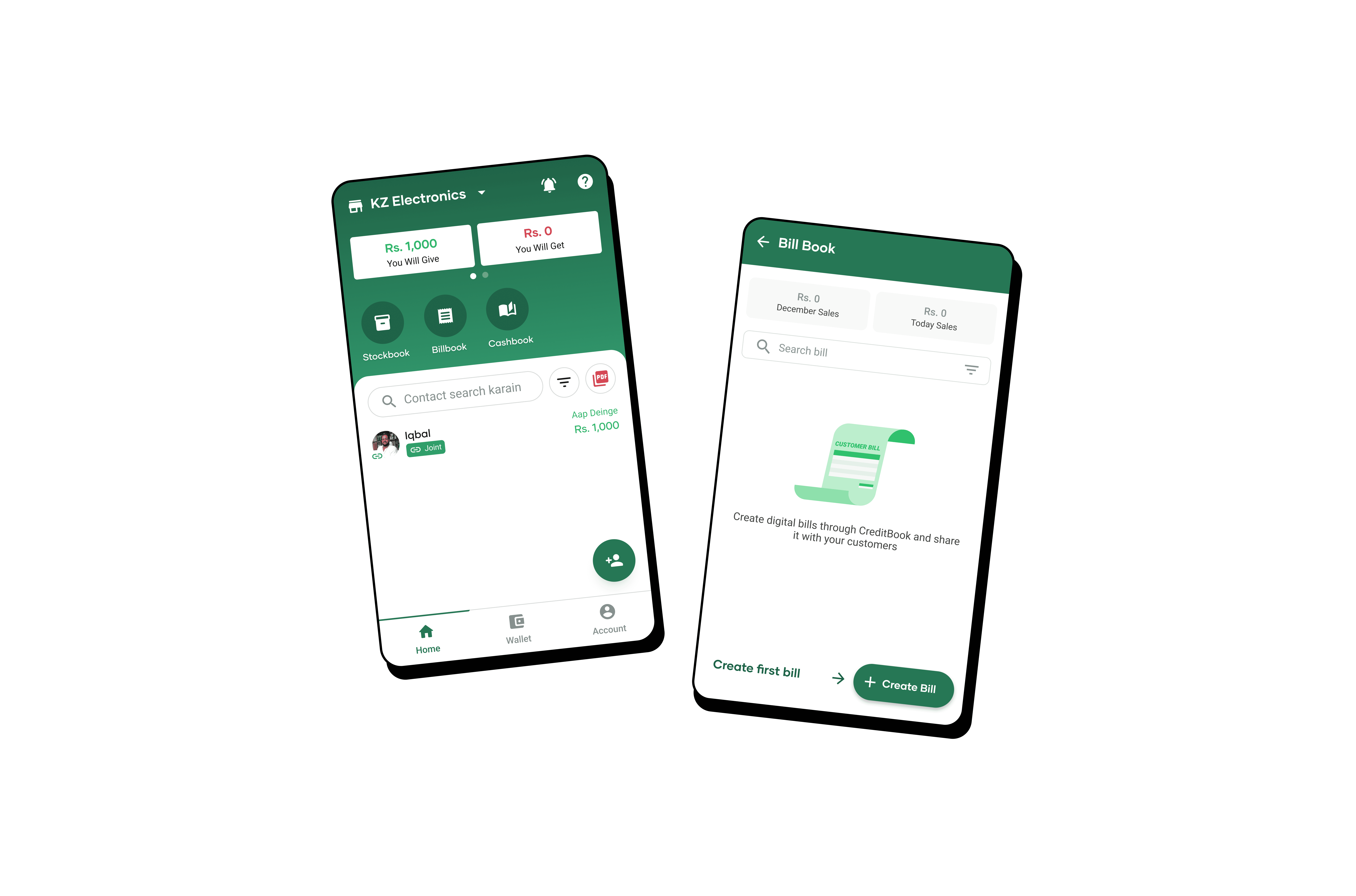
"Bill Book" Instead of Invoicing: Using the local vernacular, we named the feature "Bill Book," aligning with what users already called their paper registers.
Minimal Input Fields: We focused on essential fields like item names, quantities, and total amounts—no complex jargon or unnecessary options.
Seamless Integration: Users could access the "Bill" option during transaction creation, mirroring their real-world process.
Prototyping in Roman Urdu: Knowing our audience preferred Roman Urdu, we made this our default language for the prototype. This made testing smoother and ensured users understood the interface immediately.


We conducted usability tests with 9 participants across Lahore and Karachi. Here’s what we learned:
Wins:
Shareability: Users loved being able to share bills via WhatsApp, a popular communication channel.
Ease of Use: The simplified, column-based layout mimicked physical bill books, improving user understanding and reducing errors.
Feel-Good Factor: The digital bill gave users a sense of ownership and pride in their business.
Challenges:
Redundant Features: The "Paid/Unpaid" toggle wasn’t needed; users preferred tracking unpaid bills through their ledger.
Discount Field: Users found little use for a dedicated discount field, viewing it as extra effort.
Iteration Based on Feedback:
We removed the "Paid/Unpaid" option and minimized unnecessary fields.
We enhanced the design to align even closer with traditional bill book layouts.


Animated "Add Bill" Button: A nudge for users to start adding bills, reducing friction.
Bill Overview Section: Quick access to “Today’s Sales” and “Monthly Sales,” making tracking daily earnings easy.
Search & Sort Functionality: Users could search bills by date or amount, enhancing discoverability.
PDF Download and WhatsApp Sharing: Flexibility for users to share their bills directly with customers.

Due to the complexity and scope of the project, there were a lot of leanings:
Hacking Habits: Users love a good hack. We noticed they were already "hacking" the notes feature for invoices, proving they’ll find creative solutions to meet their needs.
Less is More: Extra fields mean extra effort. Our users wanted a quick, straightforward process without unnecessary inputs.
Language Matters: Speaking the users’ language (literally) made our designs more intuitive and user-friendly.
Respect the Mental Model: Aligning our design with physical bill books ensured a smooth transition from paper to digital.
Integrating Inventory Management: Users have requested an inventory feature tied to invoicing, which we’re already working on.
Improving Visibility: We plan to move the "Bill Book" to the home screen to increase user engagement.
Predictive Text: To reduce user effort, we aim to introduce predictive text for faster data entry.
Since the launch, our invoicing feature has seen steady adoption among our user base. Merchants now have a reliable, easy-to-use digital alternative to paper bills, helping them streamline their operations and get a clearer view of their finances. The journey doesn’t end here—we’re committed to refining the feature based on user feedback, ensuring it continues to meet the needs of MSMEs across Pakistan.
Next Steps: We’re gearing up for our next round of user interviews to keep iterating and improving the experience. Stay tuned!